
Recent work
Sites you can go and click
Every one of these is live, and each has a write-up of what it had to do and how it performs today. They run from Naperville to Mumbai, Indore, Montreal and Delhi — a project happens over calls and email either way.
-
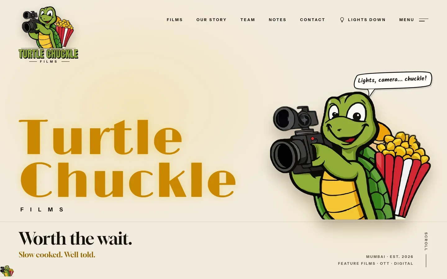 One film streaming, two in the works, and a turtle who walks you down the page. Paints in 296 ms Read the case study
-
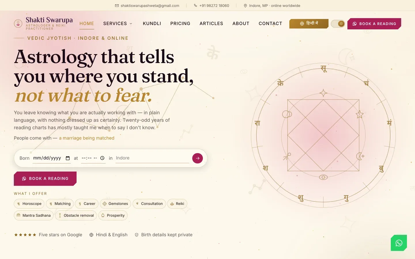 Bilingual Hindi/English, a live kundli chart, and booking that lands on WhatsApp. Paints in 1344 ms Read the case study
-
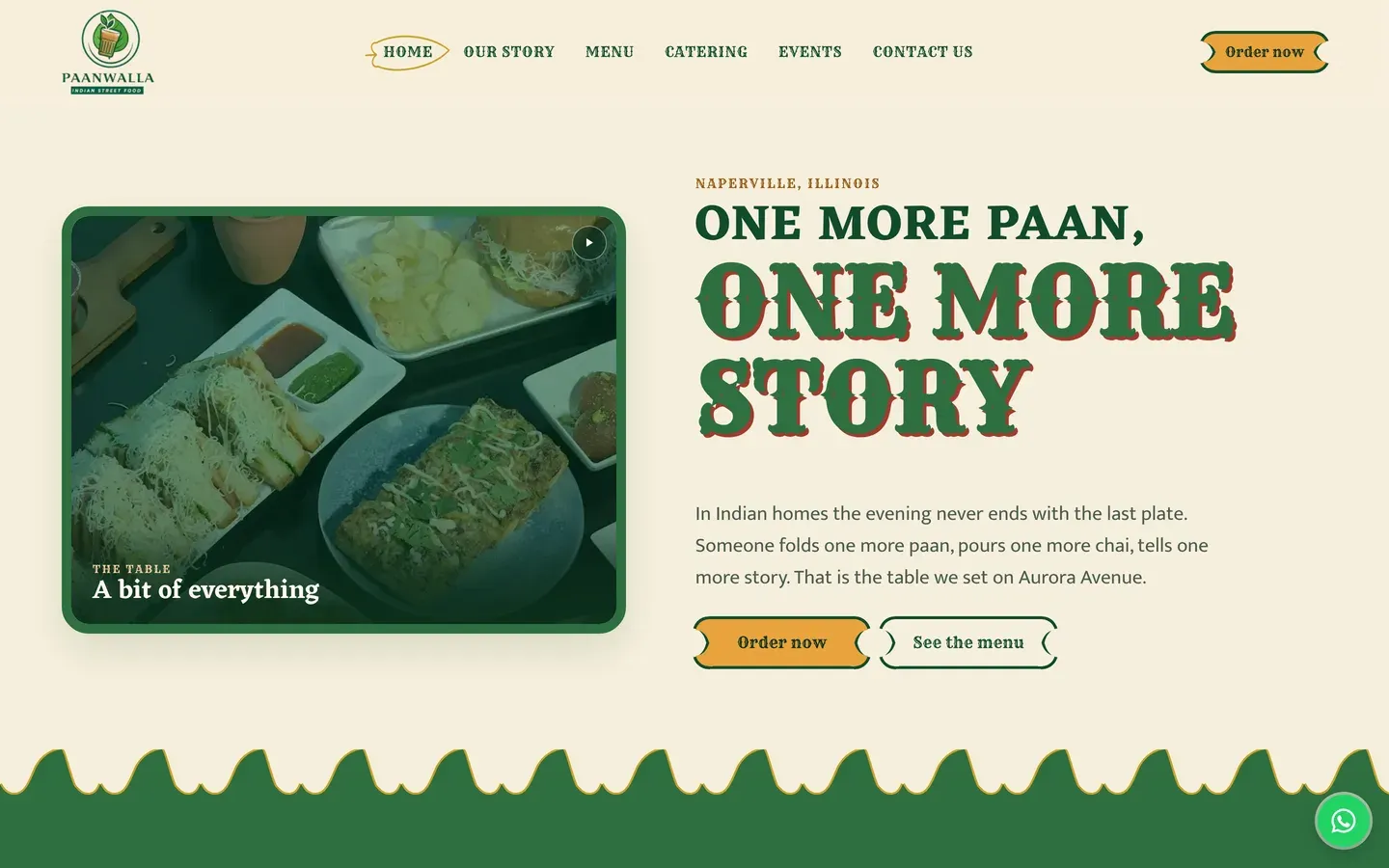 Menu, online ordering and a phone number people actually call. Paints in 1020 ms Read the case study
-
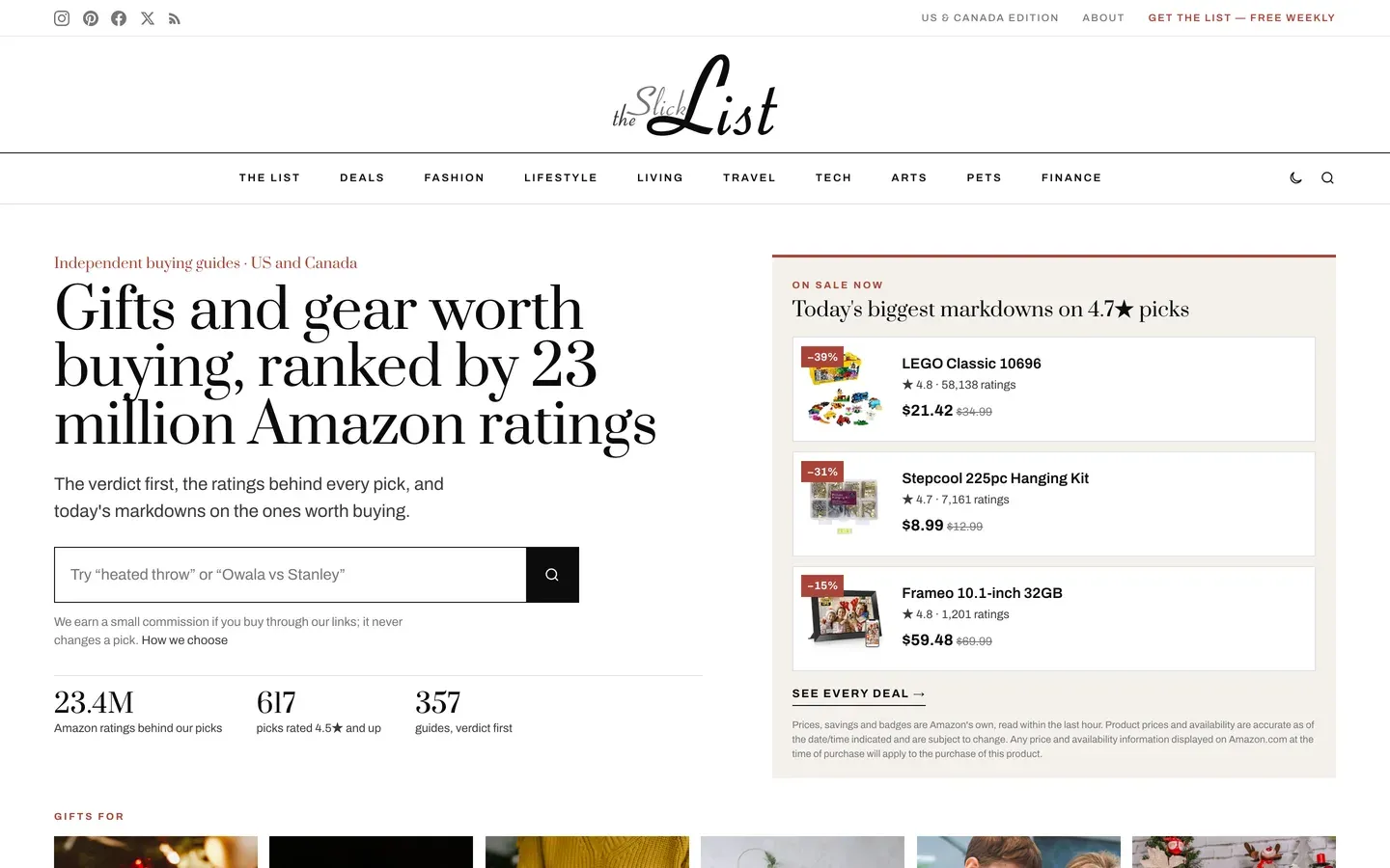 A listing site that loads quickly on a bad connection. Paints in 576 ms Read the case study
-
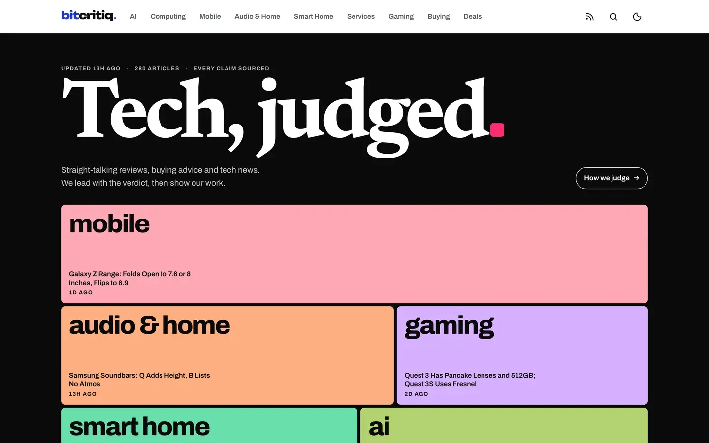 Leads with the verdict, then shows the working — built to be read, not scrolled past. Paints in 604 ms Read the case study
-
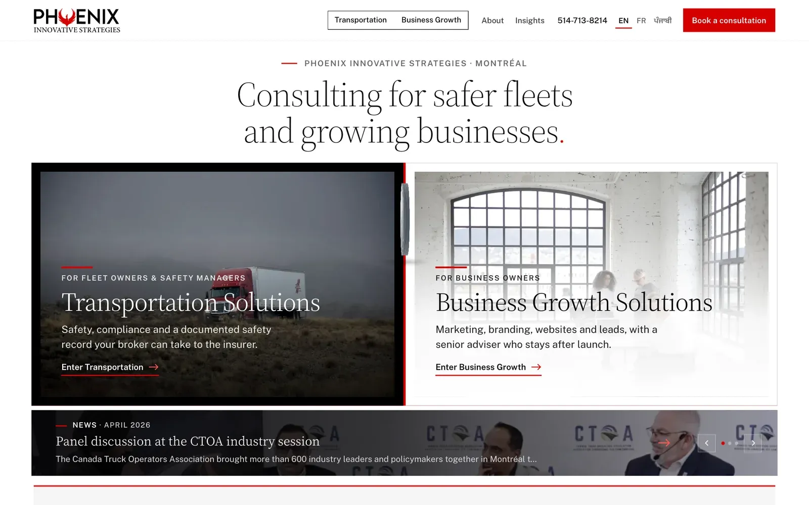 Straightforward, fast, and it says what they do. Paints in 488 ms Read the case study
-
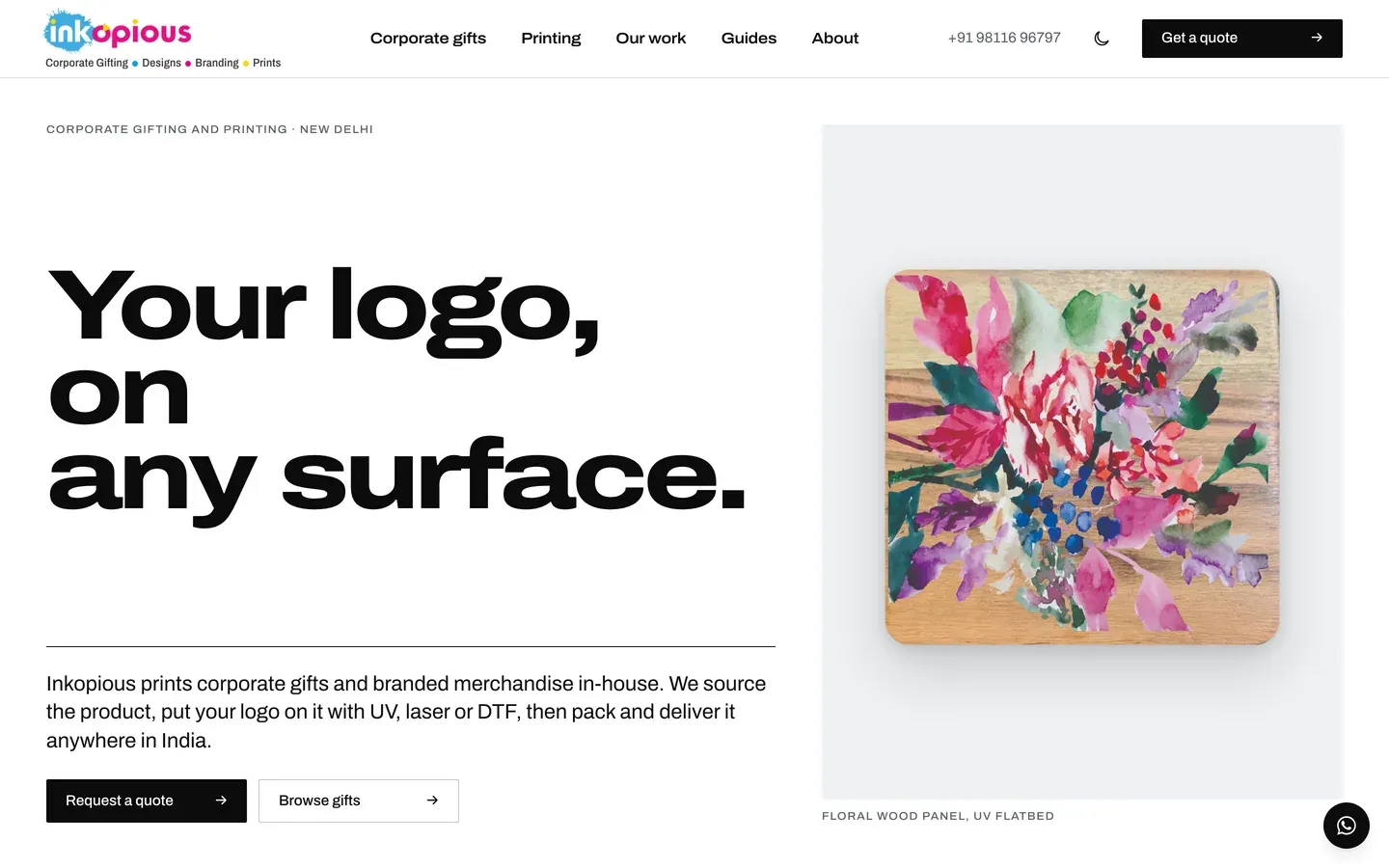 Catalogue-led, built to be browsed on a phone. Paints in 780 ms Read the case study
-
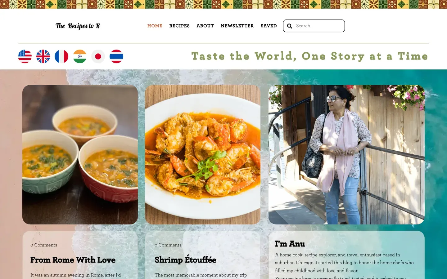 Recipes that stay readable on a phone in a kitchen. Paints in 1928 ms Read the case study
-
 A credible front door for a consultancy that had none. Paints in 844 ms Read the case study
Want yours in this list?
Tell us what the business does and we'll tell you what it takes.
On every one of them
The part of the job you cannot see in a screenshot
Every site we build now gets all of this, whichever plan it is on. Most of it is invisible until it is missing.
- Works on whatever they are holding Checked on a phone, a tablet and a desktop, down to the narrow screen of a folding phone. Not shrunk to fit: laid out so it reads properly at each size.
- Readable by the AI assistants people now ask More people start with ChatGPT or a search assistant than with a search box. The words on the page are plain text an assistant can read and quote, rather than something it has to run to see, and the site tells them it is welcome.
- Built to recognised accessibility guidelines We follow WCAG 2.2 AA, the standard most of the world writes into law. That means it works by keyboard, the text can be enlarged without the layout breaking, colours stay readable, and photographs are described for anyone who cannot see them. We follow the guidelines and test against them; we do not sell a certificate, because nobody can honestly certify this.
- Looks right in daylight and at night Where it suits the brand, the site follows the light or dark setting on the visitor's own device, and offers a switch for anyone who prefers the other one.
- Fast on a bad signal The pages are small and there is very little for the phone to do before it can show them, which is what matters in a van or a car park rather than on office wifi.
- Looks right when somebody shares it Paste a link into WhatsApp, LinkedIn or a text and a proper card appears with the right title and picture, rather than a bare address.