
Case study
Phoenix Innovative Strategies
A Montreal consultancy whose four practice areas had been collapsed into one page.
What it had to do
Risk management, process improvement, idea management and marketing solutions. Four genuinely different services sold to four different buyers, with an appointment as the goal rather than a sale.
What we decided
The common failure in consulting sites is a single services page listing everything. It cannot rank for any one of them, and a visitor with a specific problem cannot tell whether this firm actually does their thing or merely lists it.
Splitting the four out was most of the work. Each practice area gets its own page, its own explanation and its own route to an appointment, so somebody searching for process improvement lands somewhere that is about process improvement.
The appointment is the conversion rather than the enquiry, which changes the call to action throughout. Booking a slot is a smaller commitment than describing your problem to a stranger in a text box, and it converts better for exactly that reason.
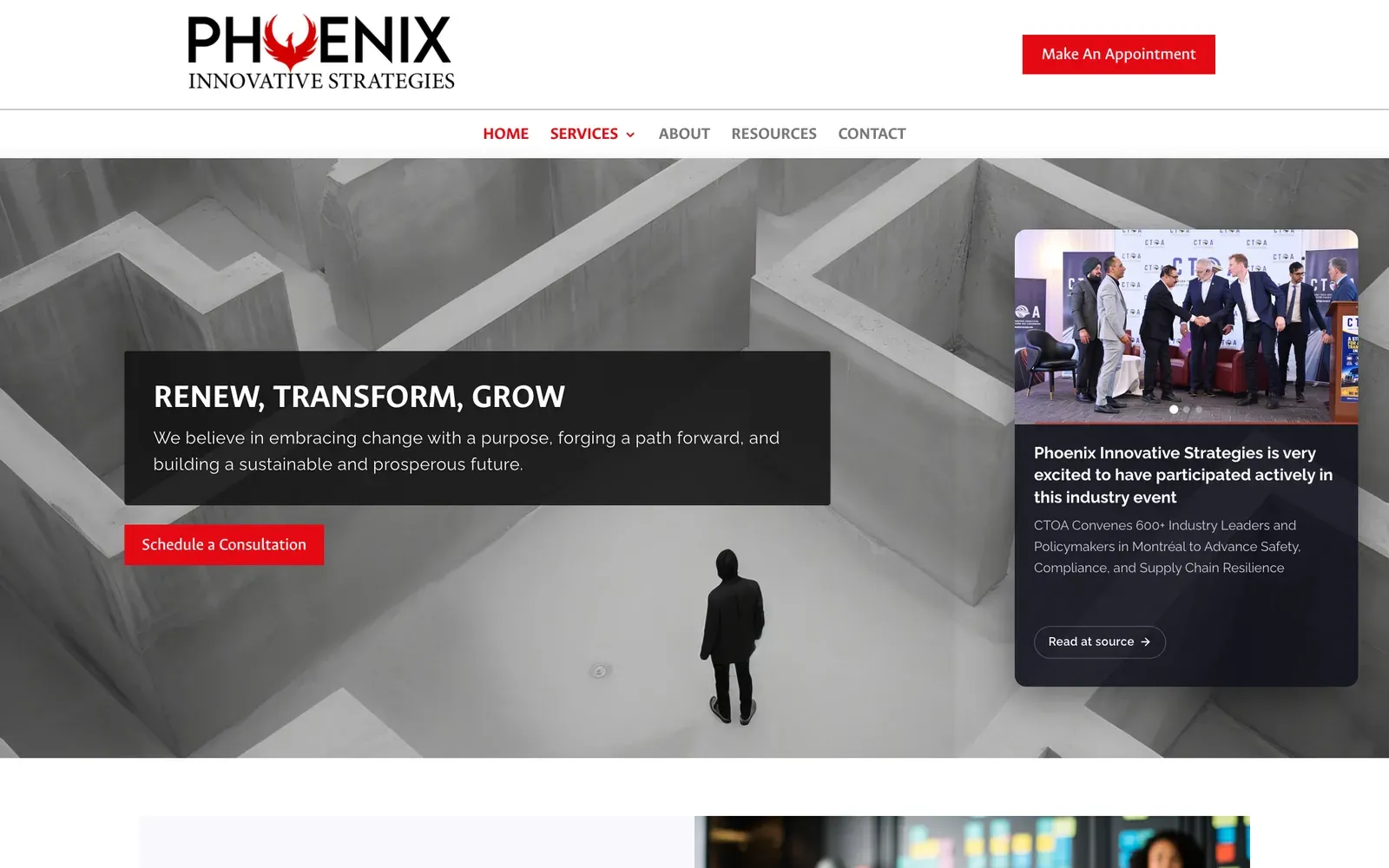
The rebuild went further than the structure. The old site opened on a stock photograph of a man in a concrete maze, carried no main heading at all, and had no description for a search engine to quote. What replaced it says who it is for in the first line, in three languages, and gives a visitor something useful to do before they have spoken to anybody.
What is on the site
Two front doors, because there are two businesses
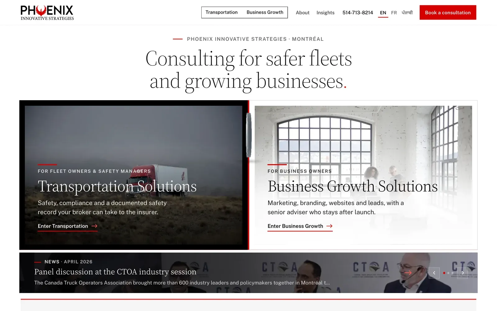
Fleet owners and safety managers arrive for one thing, business owners for another. The home page asks which you are before it tells you anything, rather than averaging the two into language that suits neither.
Written three times, not translated once
English, French and Punjabi, each written from scratch rather than run through a translator, then read cold by somebody else and translated back to check it still said the same thing. The Punjabi edition exists because a great many of the small trucking firms in this market are run in Punjabi, and nobody else is talking to them in it.
A fifteen-question check on your own business
Not a quiz to harvest an email. Fifteen statements, a score for each area of the business, and the first actions for whichever area came out weakest. It tells you something before you have spoken to anybody.
Every old link still arrives
Nine years of pages, including the two case studies that search engines had actually found, land on their equivalent in a single step rather than being dumped on the home page or lost.
Findable by the AI assistants people now ask
A plain-text summary of the firm for the assistants that look for one, and a row in the footer that opens Claude, ChatGPT, Google AI Mode or Perplexity with the question already written, in the reader's own language and naming their city.
Enquiries that cannot quietly vanish
Each one is held until the mail server confirms it has taken it, and retried if it has not. Nothing is kept afterwards, and the privacy page says so.
Asks before it counts you, where the law asks that
Visitors in Europe and the UK are asked first. Everyone else gets a plain notice and a switch on the privacy page that turns it off for good.
Before and after
| Before | After | |
|---|---|---|
| Page weight before a single image | 248 KB | 110 KB |
| Everything the page pulls down | 1,802 KB | 415 KB |
| Things the browser must fetch | 63 | 19 |
| Separate scripts | 36 | 3 |
| Headings a reader or a search engine can navigate by | no main heading at all | one, on every page |
| Photographs described for anyone who cannot see them | 13 of 22 | all of them |
Measured 23 October 2026. Counts and page weight only, and no paint or load times at all. Nothing was measured while the original was on its own hosting, and the preserved copy runs on ours, so any timing taken now would be a measurement of our hosting rather than of the old site. The figures below are properties of the build itself and travel with it wherever it is served from. Both sides read on the same emulated phone on the same day.
How it performs
- 488 msto paint the main content, on an emulated mid-range phone
- 189 msto first byte
- 381 KBtransferred, across 19 requests
Measured 2026-10-24. Median of 3 loads, emulated mid-range phone at 390px, cold cache, waiting for the load event. For context, the median across the 300 Chicago-area small business sites we tested was 1,406 ms, and Google treats anything under 2,500 ms as good. This site is about 2.9× quicker than the local median.
Re-measured rather than remembered, which is why the date is on it.
Where it stands in search
Appearing for consulting searches around the middle of the results, and in the top fifteen for the compliance case study it published. The rebuilt site went live in late October 2026, so anything after that is too early to read.
Checked 23 October 2026. Go and run the search yourself — that is the point of putting it here. What we do not publish is the client's own traffic: those numbers are theirs, not ours to hand around.
Worth taking from this
If you sell four things, you need four pages. One page listing all of them competes for nothing and reassures nobody.
Every site, not just this one
What this client got without asking
Every site we build now gets all of this, whichever plan it is on. Most of it is invisible until it is missing.
- Works on whatever they are holding Checked on a phone, a tablet and a desktop, down to the narrow screen of a folding phone. Not shrunk to fit: laid out so it reads properly at each size.
- Readable by the AI assistants people now ask More people start with ChatGPT or a search assistant than with a search box. The words on the page are plain text an assistant can read and quote, rather than something it has to run to see, and the site tells them it is welcome.
- Built to recognised accessibility guidelines We follow WCAG 2.2 AA, the standard most of the world writes into law. That means it works by keyboard, the text can be enlarged without the layout breaking, colours stay readable, and photographs are described for anyone who cannot see them. We follow the guidelines and test against them; we do not sell a certificate, because nobody can honestly certify this.
- Looks right in daylight and at night Where it suits the brand, the site follows the light or dark setting on the visitor's own device, and offers a switch for anyone who prefers the other one.
- Fast on a bad signal The pages are small and there is very little for the phone to do before it can show them, which is what matters in a van or a car park rather than on office wifi.
- Looks right when somebody shares it Paste a link into WhatsApp, LinkedIn or a text and a proper card appears with the right title and picture, rather than a bare address.