
Case study
Burrs Consultancy
An engineering consultancy whose own site described somebody else.
What it had to do
Industrial and plant engineering, request-for-quote management, sold to businesses over long cycles. The buyers research quietly, compare several firms, and decide largely before anyone speaks. The site had to survive that reading.
What we decided
Business-to-business engineering is not bought from a brochure. A buyer arrives with a specific problem, reads several pages, checks whether this firm has handled anything like it, and only then makes contact. That means the site is judged on whether it appears to know the subject, not on how many calls to action it carries.
The firm had the substance and none of the evidence of it. The site it had was a page-builder template that had never been finished: placeholder text still sat on the industries page, the testimonials were from three people who do not exist, the phone number belonged to nobody at the firm, and the photographs were of construction sites it had no connection to. A buyer checking whether this outfit was real found a page that could not survive the check.
So the structure leads with the domains rather than the company: quote management and process development first, at the firm's own request, then the rest of the engineering work and the industries it serves. A buyer should be able to find their own problem named within a few seconds of arriving, which is the thing most consultancy sites make impossible.
Everything on the page now came from the client: their deck, their customers, their address, their director. That sounds like a low bar until you read what was there before.
What is on the site
Organised by domain, not by department
A visitor finds their problem named rather than reading about the firm and inferring. The two the firm wants most, quote management and process development, lead.
The part they make, turning as you read
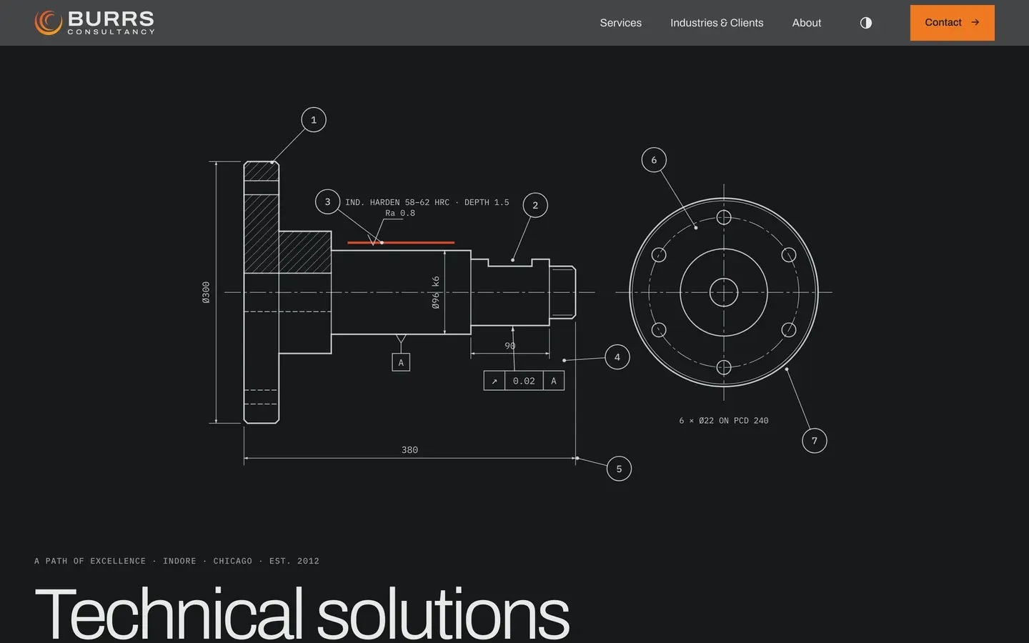
The home page is built around a component you can look at from any angle, and scrolling walks it through what Burrs actually does to it: drawing, machining, heat treatment, measurement. A phone that cannot run it smoothly gets an engineering drawing instead, which is the same explanation without the cost.
A named director, a real address, working phone numbers
The old site carried a phone number that belonged to nobody at the firm, testimonials from people who do not exist, and photographs of construction sites it had never worked on. All of it is gone, and what replaced it came from the client.
Every old address still works
Nine years of links, from suppliers and directories and other people's pages, still arrive where they always did rather than at an error.
Readable in daylight or at night
It follows whatever the visitor's own device is set to, with a switch for anyone who wants the other one.
Asks before it counts you, where the law asks that
Visitors in Europe and the UK are asked first and nothing is measured until they agree. Everyone else gets a plain notice and a one-click way out on the privacy page.
Before and after

| Before | After | |
|---|---|---|
| Page weight before a single image | 218 KB | 114 KB |
| Things the browser must fetch | 56 | 10 |
| Separate scripts | 27 | 3 |
| Separate stylesheets | 9 | 1 |
| Other companies contacted to draw the page | 6 | 1 |
Measured 20 October 2026. Both measured the same way, on the same emulated phone, five runs each, median reported. The old site is timed on its own hosting rather than on a copy of it, and its caching was warm, because a single cold run of it would have been a flattering comparison rather than a fair one. No paint times are published here on purpose: the new home page loads its moving model after everything else, which makes it the largest thing on the screen and puts that measurement at several seconds, while the words arrive in under half of one. Quoting either number against the old site compares two different things, and the old site is gone, so there is no fair version left to take.
How it performs
- 844 msto paint the main content, on an emulated mid-range phone
- 625 msto first byte
- 191 KBtransferred, across 13 requests
Measured 2026-10-24. Median of 3 loads, emulated mid-range phone at 390px, cold cache, waiting for the load event. For context, the median across the 300 Chicago-area small business sites we tested was 1,406 ms, and Google treats anything under 2,500 ms as good. This site is about 1.7× quicker than the local median.
Re-measured rather than remembered, which is why the date is on it.
Where it stands in search
Appearing around position four for the consultancy's own name and in the top ten for its about page. The rebuilt site went live on 20 October 2026, so everything after that is too early to read and we would rather say so than dress it up.
Checked 20 October 2026. Go and run the search yourself — that is the point of putting it here. What we do not publish is the client's own traffic: those numbers are theirs, not ours to hand around.
Worth taking from this
Business buyers read before they enquire. The page that names their problem in its first line beats the one that opens with a founding date.
Every site, not just this one
What this client got without asking
Every site we build now gets all of this, whichever plan it is on. Most of it is invisible until it is missing.
- Works on whatever they are holding Checked on a phone, a tablet and a desktop, down to the narrow screen of a folding phone. Not shrunk to fit: laid out so it reads properly at each size.
- Readable by the AI assistants people now ask More people start with ChatGPT or a search assistant than with a search box. The words on the page are plain text an assistant can read and quote, rather than something it has to run to see, and the site tells them it is welcome.
- Built to recognised accessibility guidelines We follow WCAG 2.2 AA, the standard most of the world writes into law. That means it works by keyboard, the text can be enlarged without the layout breaking, colours stay readable, and photographs are described for anyone who cannot see them. We follow the guidelines and test against them; we do not sell a certificate, because nobody can honestly certify this.
- Looks right in daylight and at night Where it suits the brand, the site follows the light or dark setting on the visitor's own device, and offers a switch for anyone who prefers the other one.
- Fast on a bad signal The pages are small and there is very little for the phone to do before it can show them, which is what matters in a van or a car park rather than on office wifi.
- Looks right when somebody shares it Paste a link into WhatsApp, LinkedIn or a text and a proper card appears with the right title and picture, rather than a bare address.