
Case study
Shakti Swarupa
A Vedic astrologer in Indore, working in two languages, booking through WhatsApp.
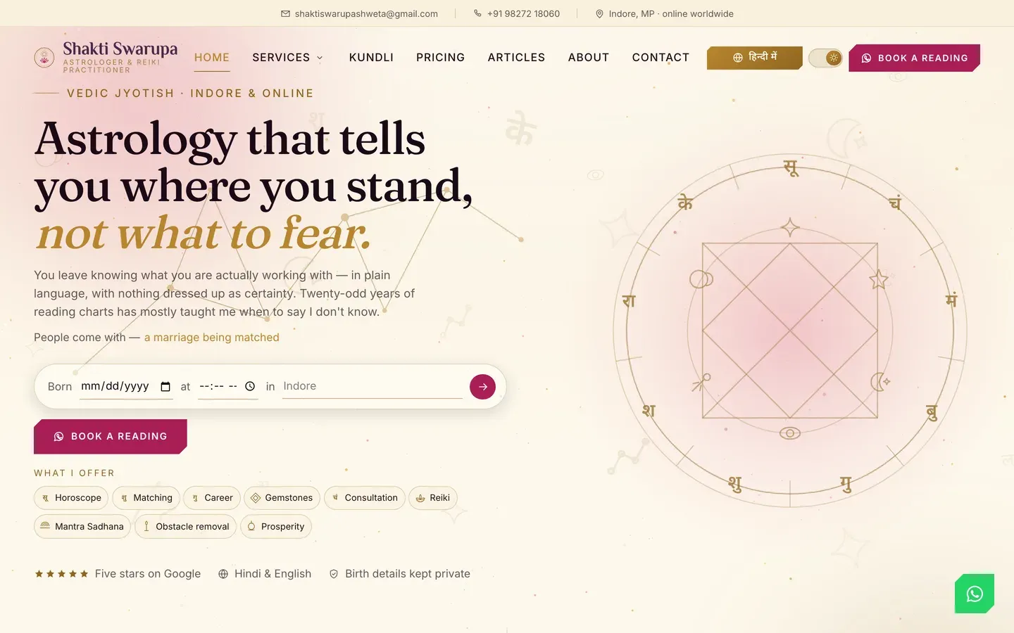
What it had to do
A practice built on personal trust, in a field crowded with sites that trade on fear. The brief was to be plainly credible: real prices, a real process, and a booking route that matched how clients already communicate.
What we decided
The category problem was tone. Astrology sites tend to promise certainty and imply consequences, which works on some people and repels the rest. The positioning chosen here is the opposite and it is stated in the first line on the page: a chart tells you what you are working with, it does not decide anything.
That decision runs through everything else. Prices are published rather than quoted on request. The process is four stated steps. The questions people actually ask get answered before they have to ask them.
Booking goes to WhatsApp, which is not a compromise in this market but the correct answer. It is where the conversation was going to happen anyway, and a form that emails a stranger adds a step that loses people.
What is on the site
Hindi and English throughout
Not a translation widget bolted on. The audience moves between both, and the site does too.
Prices stated up front
What a reading costs, published, in a category where almost nobody does it. It is the single strongest trust signal on the page.
Six services, each explained
Birth chart, kundli matching, career guidance, gemstones and personal consultation, each its own thing rather than a list item.
WhatsApp and a tappable number
Booking lands where the client already is, rather than in an inbox they have to wait on.
A four-step process, stated
What happens after you get in touch, before you have to commit to anything.
How it performs
- 1344 msto paint the main content, on an emulated mid-range phone
- 249 msto first byte
- 426 KBtransferred, across 20 requests
Measured 2026-10-24. Median of 3 loads, emulated mid-range phone at 390px, cold cache, waiting for the load event. For context, the median across the 300 Chicago-area small business sites we tested was 1,406 ms, and Google treats anything under 2,500 ms as good. This site is about 1.0× quicker than the local median.
Re-measured rather than remembered, which is why the date is on it.
Where it stands in search
Shows on the first page for Hindi-language astrology searches, which is the audience this one was built for and the reason it is bilingual.
Checked 20 September 2026. Go and run the search yourself — that is the point of putting it here. What we do not publish is the client's own traffic: those numbers are theirs, not ours to hand around.
Worth taking from this
In a category that sells certainty, refusing to was the positioning. Published prices did more for credibility than any design choice.
Every site, not just this one
What this client got without asking
Every site we build now gets all of this, whichever plan it is on. Most of it is invisible until it is missing.
- Works on whatever they are holding Checked on a phone, a tablet and a desktop, down to the narrow screen of a folding phone. Not shrunk to fit: laid out so it reads properly at each size.
- Readable by the AI assistants people now ask More people start with ChatGPT or a search assistant than with a search box. The words on the page are plain text an assistant can read and quote, rather than something it has to run to see, and the site tells them it is welcome.
- Built to recognised accessibility guidelines We follow WCAG 2.2 AA, the standard most of the world writes into law. That means it works by keyboard, the text can be enlarged without the layout breaking, colours stay readable, and photographs are described for anyone who cannot see them. We follow the guidelines and test against them; we do not sell a certificate, because nobody can honestly certify this.
- Looks right in daylight and at night Where it suits the brand, the site follows the light or dark setting on the visitor's own device, and offers a switch for anyone who prefers the other one.
- Fast on a bad signal The pages are small and there is very little for the phone to do before it can show them, which is what matters in a van or a car park rather than on office wifi.
- Looks right when somebody shares it Paste a link into WhatsApp, LinkedIn or a text and a proper card appears with the right title and picture, rather than a bare address.