
Case study
The Slick List
Research-led buying advice for the US and Canada, built to stay quick as the archive grows.
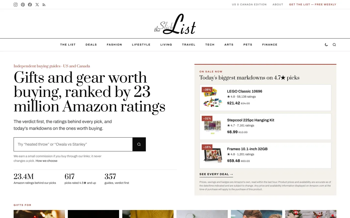
What it had to do
A directory and recommendation site across nine categories, from fashion to finance. Directories get slower every time something is added, and this one had to be readable on a weak connection from the first day and the thousandth entry.
What we decided
The failure mode for a listings site is predictable. It launches light, it grows, and two years later every page carries a library of scripts nobody remembers adding. The decision here was to treat page weight as a constraint rather than an outcome.
The editorial position mattered as much. This is advice, not affiliate filler, so the site had to look like something that reads spec sheets rather than something that scrapes them. Shortlists are the format that does that, and they are also what people actually search for.
A weekly email sits alongside the site, which is the part of a publication somebody can own rather than rent from a search engine.
The refresh went after the thing that makes buying advice worth reading, which is whether you can tell where the numbers came from. Every rating now arrives with its count and the date it was read, nothing claims to have been tested, and the commission is disclosed before the first pick rather than after the last. The site also renamed itself: it was theSlickList, written as one word, and nobody searching for it typed it that way.
What is on the site
Every pick ranked on numbers, and the numbers are shown
Picks are ordered by their Amazon star rating and then by how many people left one, and a rating never appears without its count: "4.7 across 1,179 ratings" rather than "4.7 stars". The guides on the site rest on 23.4 million ratings between them.
It tells you it has not touched the products
Under the byline of every guide, not in the small print: research-led, nothing handled. A publication that says plainly what it has not done is easier to believe about what it has.
Every figure carries the day it was read
"Read off the Amazon listings on 10 October 2026 and true as of that date." A number without a date is a claim about the past pretending to be about the present.
No price is ever typed into a page
Prices, savings and deal badges come straight from Amazon and refresh through the day. If that stops, the card quietly falls back to "see it at Amazon" rather than showing yesterday's price as though it were today's.
A markdown has to be real to appear
The deals only list genuine Amazon reductions on things rated at least 4.5 across a thousand ratings, and a saving measured against a list price has to beat a quarter off before it counts, because list prices are the number most often inflated.
The commission is disclosed before you read a word
On the first screen, under every byline, and on a page of its own: a commission is earned, and it never changes a pick. Every shopping link is marked as paid.
It does not pass off Amazon's stars as its own
The ratings are marked up for search engines as the products' own, never as a score this site awarded. It is a small distinction and almost nobody makes it.
Every address from the old site still works
The 47 guides carried over keep the exact paths they had, and the old archives, feeds and page-two links all arrive at the right place instead of an error.
Why there is no before and after
The site it replaced was a WordPress build that nothing survives of: no screenshot, no page weight, no request count, and no host still serving it. The Internet Archive holds copies, and its replay of them is broken enough that publishing one would make the original look worse than it actually was, which is not a comparison, it is a cheap shot. So every number on this page is of the site as it stands today.
How it performs
- 576 msto paint the main content, on an emulated mid-range phone
- 408 msto first byte
- 951 KBtransferred, across 36 requests
Measured 2026-10-24. Median of 3 loads, emulated mid-range phone at 390px, cold cache, waiting for the load event. For context, the median across the 300 Chicago-area small business sites we tested was 1,406 ms, and Google treats anything under 2,500 ms as good. This site is about 2.4× quicker than the local median.
Re-measured rather than remembered, which is why the date is on it.
Where it stands in search
First result for its own name, which took renaming the site to match what people actually type, and indexed across all 413 of its pages. Buying searches are early: an archive earns those as it grows.
Checked 23 October 2026. Go and run the search yourself — that is the point of putting it here. What we do not publish is the client's own traffic: those numbers are theirs, not ours to hand around.
Worth taking from this
Page weight on a growing site is a decision made once, at the start. Everything after that is either honouring it or undoing it.
Every site, not just this one
What this client got without asking
Every site we build now gets all of this, whichever plan it is on. Most of it is invisible until it is missing.
- Works on whatever they are holding Checked on a phone, a tablet and a desktop, down to the narrow screen of a folding phone. Not shrunk to fit: laid out so it reads properly at each size.
- Readable by the AI assistants people now ask More people start with ChatGPT or a search assistant than with a search box. The words on the page are plain text an assistant can read and quote, rather than something it has to run to see, and the site tells them it is welcome.
- Built to recognised accessibility guidelines We follow WCAG 2.2 AA, the standard most of the world writes into law. That means it works by keyboard, the text can be enlarged without the layout breaking, colours stay readable, and photographs are described for anyone who cannot see them. We follow the guidelines and test against them; we do not sell a certificate, because nobody can honestly certify this.
- Looks right in daylight and at night Where it suits the brand, the site follows the light or dark setting on the visitor's own device, and offers a switch for anyone who prefers the other one.
- Fast on a bad signal The pages are small and there is very little for the phone to do before it can show them, which is what matters in a van or a car park rather than on office wifi.
- Looks right when somebody shares it Paste a link into WhatsApp, LinkedIn or a text and a proper card appears with the right title and picture, rather than a bare address.